
CSSで出来るアニメーションの基本的な動きについてまとめてみました。
アニメーションを付けるには?
結論から言いますが、アニメーションを付けるにはanimationプロパティとkeyframeプロパティの2つが必要になります。
- animation
- keyframes
アニメーションの動くペースなど
どんな効果を掛けるか
ざっくり言えばanimationプロパティでアニメーションを掛ける時間や開始・終了のペース、アニメーションの繰り返しなどについて指定します。
一方でkeyframeプロパティでは、animationプロパティで指定したアニメーションの時間やペースに合わせて透過や色・サイズなどの変更を掛けていく
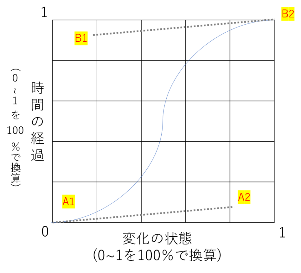
時間などが指定されていなければ変化が起きませんし、時間だけ指定してもどのようなアニメーションを掛けるかを指定しなければ何も起こりません。 そしてもう一つ注意しておく事として、animationプロパティはCSSなので基本的にページが読み込まれたタイミングで実行されます。詳しくは後ほど説明します。 animationプロパティは一括指定プロパティなので、それぞれの項目を指定する個別のプロパティがあるので見ていきましょう。 赤字は必須の指定になります。 個人的にはあまり個別で指定する機会がなく、大体は一括指定プロパティを使います。値の種類の理解が少し面倒なので順を追って見ていきましょう。 後述するkeyframesとアニメーションをリンクさせるために名前をつけておく必要があります。初期値はnoneで何も定義されていない状態なので必ず指定する必要があります。 アニメーションの動くペースなど どんな効果を掛けるか 先ほども話しましたが、keyframesで効果をつけるのはどのアニメーションなのかを紐付けしてあげます。 [CSS] 今回の例で言うなら、testというアニメーションでは最初は50%の幅で徐々に100%の幅になっていくというアニメーションの指定の仕方です。(厳密にはこれでは時間を指定していないので動きませんが) animation-durationはアニメーションに掛ける時間の指定です。 animation-duration [HTML] [CSS] 『◎s』(sはsecondで秒)と指定していきます。 アニメーションの内容としては幅を50%から100%に変化していく内容で、testanime1は3秒掛けて動き、testanime2は6秒掛けて動きます。 animation-timing-functionはアニメーションの進行するペースに関する指定をします。 (開始から終了まで滑らかに) (開始とから終了まで一定) (開始部分だけゆっくり) (終了部分だけゆっくり) (開始と終了がゆっくり) 関数で数値指定※ cubic-bezier関数は説明が長くなるので他の値について先に見ていきます。 animation-timing-function 動き方に差がありますが、最終的にアニメーションが終了するタイミングは一緒です。linear以外はanimation-duration(アニメーションに掛ける時間)が短いと動きがガクガクしやすいので注意が必要です。 cubic-bezier関数はベジェ曲線を用いてアニメーションの変化のペースについて指定する方法です。 cubic-bezier関数での指定 簡単に言えば、A1とA2、B1とB2の値を指定する事で曲線のアーチを変化させることが出来ます。 Illustratorを使う人は理解が早いかもしれませんね。 先に説明した簡易指定をcubic-bezier関数で表すと以下のようになります。 animation-delayはアニメーションが始まるまでの時間を指定します。アニメーションが開始するタイミング自体をずらすことができます。 animation-delay [HTML] [CSS] testanime3はページ読み込み後すぐに実行されていますが、testanime4は読み込み後秒が経過してからアニメーションの処理が行われます。 注意する必要があるのはCSSは基本的にページが読み込みの段階で処理がされてしまうので、ページがある程度進んだ位置にアニメーションを設定しても意図したアニメーションになりにくい場合があります。その場合はJS側でスクロールした時に発火するイベントと一緒に指定する必要があります。 animation-iteration-countではアニメーションの繰り返しについて指定します。初期値は1回で、マイナスの値を指定した場合は0として処理されます(0回なのでアニメーションにはなりません。) animation-iteration-count testanme5は2回、testanime6は無限にアニメーションを繰り返します。 [HTML] [CSS] animation-directionではアニメーションの進行方向について指定ができます。初期値はnormalです。 animation-direction [HTML] [CSS] animation-fill-modeはアニメーションの開始前、終了後のstyleについて指定ができます。 以下のサンプルでは3秒経過後にアニメーションが4回繰り返されたのち、アニメーションが終了します。分かりずらい場合はページをリロードしてみてください animation-fill-mode [HTML] ちょっとわかりづらい部分もあるのでコメントアウト付けておきます。 [CSS] animation-play-stateはアニメーションのについて指定ができます。値はrunning(初期値)とpausedの2種類です。 今回はホバーをした時にだけ値が変わるようにするという指定にしてみます。 animation-play-state [HTML] [CSS] これまでanimation関連の様々なプロパティについて見てきましたが、animationという一括指定プロパティを使えば短く書くことができます。 [HTML] animation(一括指定) 指定する順番には気を付けてください。以下の表の順番(これまで見てきた順)に指定すればOKです。 keyframesとは、animation-duration(アニメーションに掛ける時間)内でどのように変化をしていくか内容を指定するものです。『@』が先頭についているのは@規則というものです。 これまでの説明では@keyframesではwidthの値が50%から100%へ変化するように指定していました。 また、ベンダープレフィックスを必要とあらば付けていくようにしましょう。(iOS8以下やAndroid4.4.4以下対応時のみ) 開始点を0%、終了点を100%として設定します。その上で中間ポイントとして0~100%の間で好きな地点で中間ポイントを設定することも可能です。 [HTML] @keyframesで中間点作成 from=0%、to=100%と置き換えれば同じ意味になります。使う機会があるかは別として… cssアニメーションをモリモリしすぎると目が疲れますが、それでもサイトのアクセントとしておしゃれなサイトでは要所で使われています。使いこなせると幅が増えるのでしっかり理解しておきましょう。
animationプロパティ
プロパティ名
プロパティの内容
animation-name
アニメーションの名前を指定します
animation-duration
アニメーションに掛ける時間の指定です
animation-timing-function
アニメーションの進行ペースの指定です
animation-delay
アニメーションの開始タイミングの指定です
animation-iteration-count
アニメーションの繰り返し回数の指定です
animation-direction
アニメーションの繰り返しの向きの指定です
animation-fill-mode
アニメーションの開始前・終了後のstyle指定です
animation-play-state
アニメーションの実行状況の指定です
animation
アニメーションの一括指定プロパティです
animation-name
.testanime{
 animation-name:test;
}

@keyframes test{
 0% {
   width:50%
 }
 100% {
   width:100%
 }
}
animation-duration
<ul>
  <li class="testanime1">testanime1</li>
  <li class="testanime2">testanime2</li>
</ul>
.testanime1 {
 background:lightgreen;
 animation-name:test1;
 animation-duration:3s
}

.testanime2 {
 background:skyblue;
 animation-name:test1;
 animation-duration:6s
}

@-webkit-keyframes test1{
  0% {
    width:50%;
  }
  100% {
    width:100%;
  }
}

@keyframes test1{
  0% {
    width:50%;
  }
  100% {
    width:100%;
  }
}
animation-timing-function
animation-timing-function:cubic-bezier(A1,A2,B1,B2);
animation-delay
<ul>
  <li class="testanime3">testanime3</li>
  <li class="testanime4">testanime4</li>
</ul>
.testanime3 {
 background:lightgreen;
 animation-name:test3;
 animation-duration:3s;
}

.testanime4 {
 background:skyblue;
 animation-name:test3;
 animation-duration:3s;
 animation-delay:3s;
}

@-webkit-keyframes test3{
  0% {
    width:50%;
  }
  100% {
    width:100%;
  }
}

@keyframes test3{
  0% {
    width:50%;
  }
  100% {
    width:100%;
  }
}
animation-iteration-count
<ul>
  <li class="testanime5">testanime5</li>
  <li class="testanime6">testanime6</li>
</ul>
.testanime5 {
 background:lightgreen;
 animation-name:test4;
 animation-duration:3s;
 animation-iteration-count:2;
}

.testanime6 {
 background:skyblue;
 animation-name:test4;
 animation-duration:3s;
 animation-iteration-count:infinite;
}

@-webkit-keyframes test4{
  0% {
    width:50%;
  }
  100% {
    width:100%;
  }
}

@keyframes test4{
  0% {
    width:50%;
  }
  100% {
    width:100%;
  }
}
animation-direction
<ul>
  <li class="testanime7">testanime7</li>
  <li class="testanime8">testanime8</li>
  <li class="testanime9">testanime9</li>
  <li class="testanime10">testanime10</li>
</ul>
.testanime7,
.testanime8,
.testanime9,
.testanime10{
  width:50%;
  animation:test5 3s linear infinite;
  color:#fff;
}
.testanime7{
  background:red;
  animation-direction:normal;
}
.testanime8{
  background:purple;
  animation-direction:reverse;
}
.testanime9{
  background:blue;
  animation-direction:alternate;
}
.testanime10{
  background:green;
  animation-direction:alternate-reverse;
}

@-webkit-keyframes test5{
  0% {
    width:50%;
  }
  100% {
    width:100%;
  }
}

@keyframes test5{
  0% {
    width:50%;
  }
  100% {
    width:100%;
  }
}
animation-fill-mode
<ul>
  <li class="testanime11">testanime11</li>
  <li class="testanime12">testanime12</li>
  <li class="testanime13">testanime13</li>
  <li class="testanime14">testanime14</li>
</ul>
.testanime11,
.testanime12,
.testanime13,
.testanime14{
  /*基本のwidthは80%で3秒後にアニメーション開始*/
  width:80%;
  animation:test6 3s 3s linear 2;
  color:#fff;
}
.testanime11{
  background:red;
  /*animation-fill-mode:none*/
  /*アニメーション前後はデフォルトの値*/
  animation-fill-mode:none;
}
.testanime12{
  background:purple;
  /*animation-fill-mode:backwards*/
  /*アニメーション前は0%の値*/
  /*アニメーション後はデフォルトの値*/
  animation-fill-mode:backwards;
}
.testanime13{
  background:blue;
  /*animation-fill-mode:forwards*/
  /*アニメーション前はデフォルトの値*/
  /*アニメーション後は100%の値*/
  animation-fill-mode:forwards;
}
.testanime14{
  background:green;
  /*animation-fill-mode:both*/
  /*アニメーション前は0%の値*/
  /*アニメーション後は100%の値*/
  animation-fill-mode:both;
}

@-webkit-keyframes test6{
  0% {
    width:50%;
  }
  100% {
    width:100%;
  }
}

@keyframes test6{
  0% {
    width:50%;
  }
  100% {
    width:100%;
  }
}
animation-play-state
<ul>
  <li class="testanime15">testanime15</li>
</ul>
.testanime15 {
 background:lightgreen;
 animation-name:test7;
 animation-duration:3s;
 animation-play-state:running;
}

.testanime15:hover {
  animation-play-state:paused;
}

@-webkit-keyframes test7{
  0% {
    width:50%;
  }
  100% {
    width:100%;
  }
}

@keyframes test7{
  0% {
    width:50%;
  }
  100% {
    width:100%;
  }
}
animation(一括指定プロパティ)
<ul>
  <li class="testanime16">testanime16</li>
  <li class="testanime17">testanime17</li>
</ul>
.testanime16 {
 background:lightgreen;
 animation-name:test8;
 animation-duration:3s;
 animation-timing-function:linear;
 animation-delay:3s;
 animation-iteration-count:infinite;
 animation-direction:alternate;
 animation-fill-mode:both;
 animation-play-state:running;
}

.testanime17 {
 background:skyblue;
 animation:test8 3s linear infinite 3s alternate both running;
}

@-webkit-keyframes test8{
  0% {
    width:50%;
  }
  100% {
    width:100%;
  }
}

@keyframes test8{
  0% {
    width:50%;
  }
  100% {
    width:100%;
  }
}
プロパティ名
プロパティの内容
animation-name
アニメーションの名前を指定します
animation-duration
アニメーションに掛ける時間の指定です
animation-timing-function
アニメーションの進行ペースの指定です
animation-delay
アニメーションの開始タイミングの指定です
animation-iteration-count
アニメーションの繰り返し回数の指定です
animation-direction
アニメーションの繰り返しの向きの指定です
animation-fill-mode
アニメーションの開始前・終了後のstyle指定です
animation-play-state
アニメーションの実行状況の指定です
keyframesとは?
developer.mozilla.org

%で指定
<ul>
  <li class="testanime18">testanime18</li>
  <li class="testanime19">testanime19</li>
</ul>
.testanime18 {
 background:lightgreen;
 animation:test9 6s linear infinite;
}

.testanime19 {
 background:skyblue;
 animation:test10 6s linear infinite;
}

/*6秒かけて0%から100%まで一直線に推移*/

@-webkit-keyframes test9{
  0% {
    width:50%;
  }
  100% {
    width:100%;
  }
}

@keyframes test9{
  0% {
    width:50%;
  }
  100% {
    width:100%;
  }
}

/*6秒の間に中間地点の値へ変化しつつ最終的に100%の値へ変化*/
@-webkit-keyframes test10{
  0% {
    width:50%;
  }
  25% {
    width:75%;
  }
  50% {
    width:50%;
  }
  75% {
    width:75%;
  }
  100% {
    width:100%;
  }
}

@keyframes test10{
  0% {
    width:50%;
  }
  25% {
    width:75%;
  }
  50% {
    width:50%;
  }
  75% {
    width:75%;
  }
  100% {
    width:100%;
  }
}
fromとtoで指定